Problem
The task was to create a landing page for a new and exciting startup that offers curated music playlists to their users. Beat.box uses a unique AI to identify songs users like. The target audience is young, socially-active, and loves to discover new music to share with friends. Beat.box wants to ensure that customers see them as modern, knowledgeable, hip, and relatable.
Solution
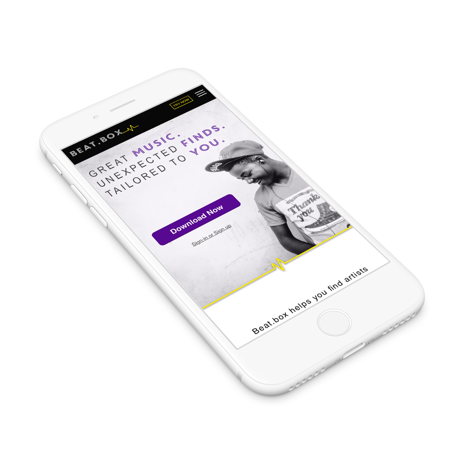
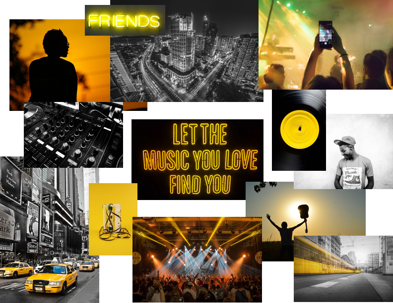
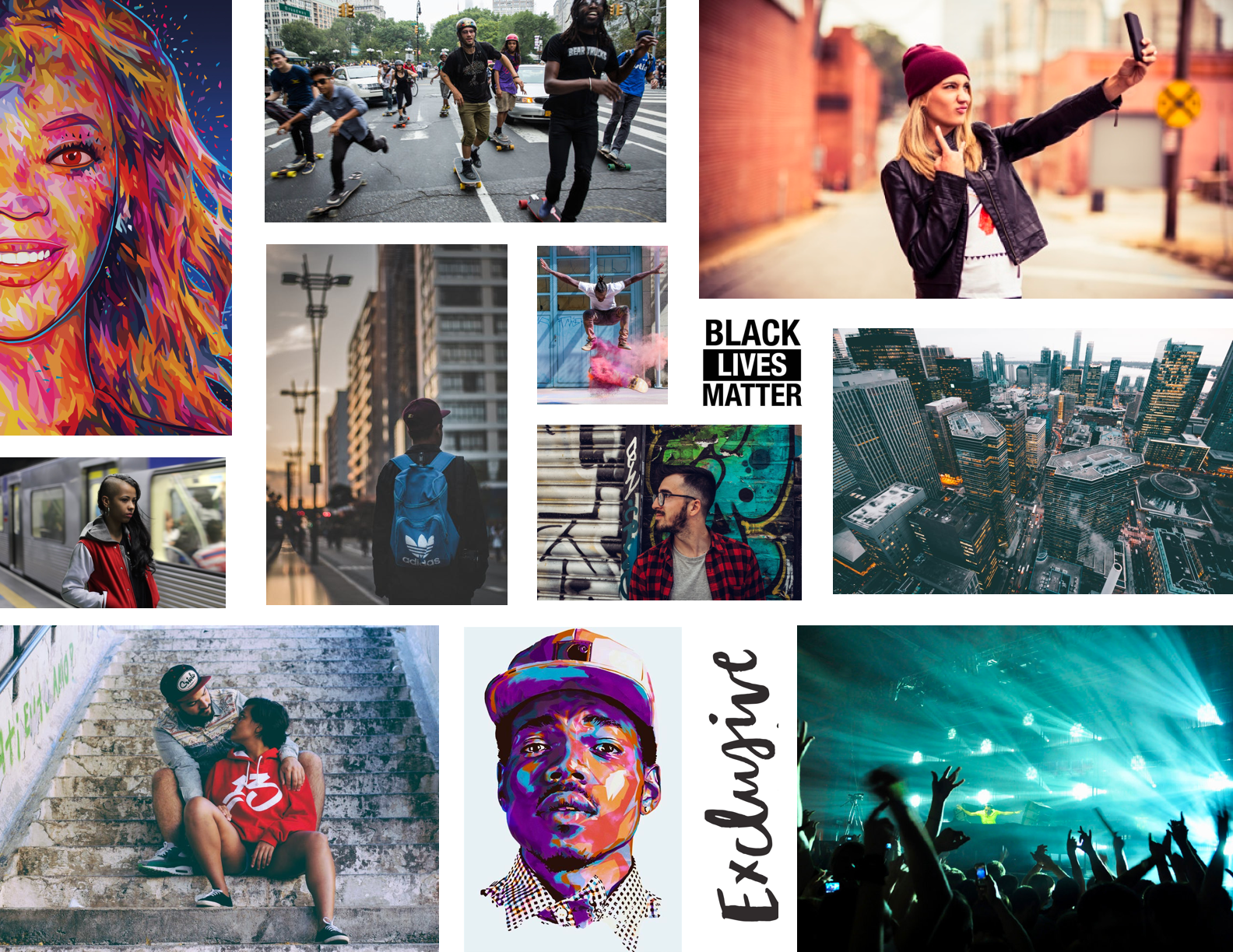
After completing the user research I learned that the Beat.box target audience is young, urban, and trendy. They listen to music to feel emotions. They love to be in-the-know about new music but they want it to be easy to do so.
From typography to images, the voice of Beat.box can be heard throughout the final product, speaking directly to the target audience.
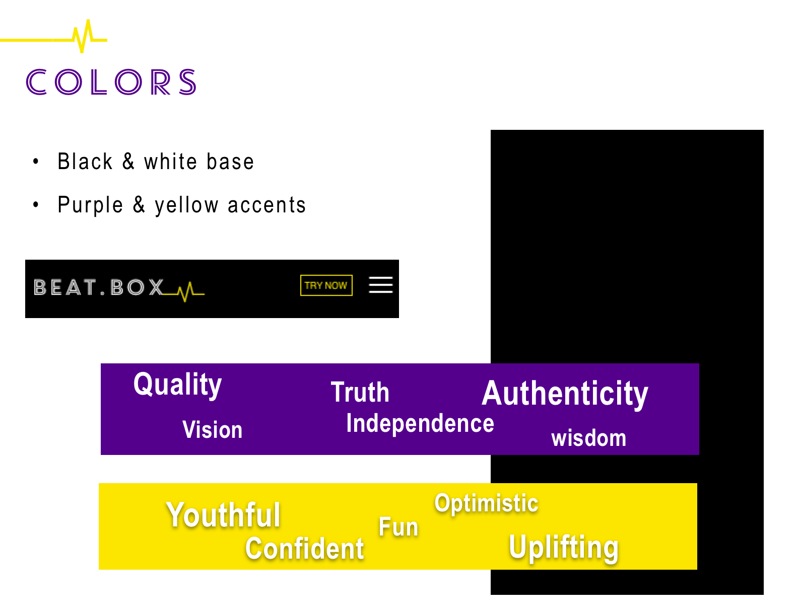
Color:
Colors: Combination of these complementary colors (purple & yellow) creates a bold, high frequency palette for a youthful and energetic vibe.
Logo, Nav, and Footer use a solid black background, with white and pops of bright yellow to draw attention to the beat mark on the logo and CTA buttons.
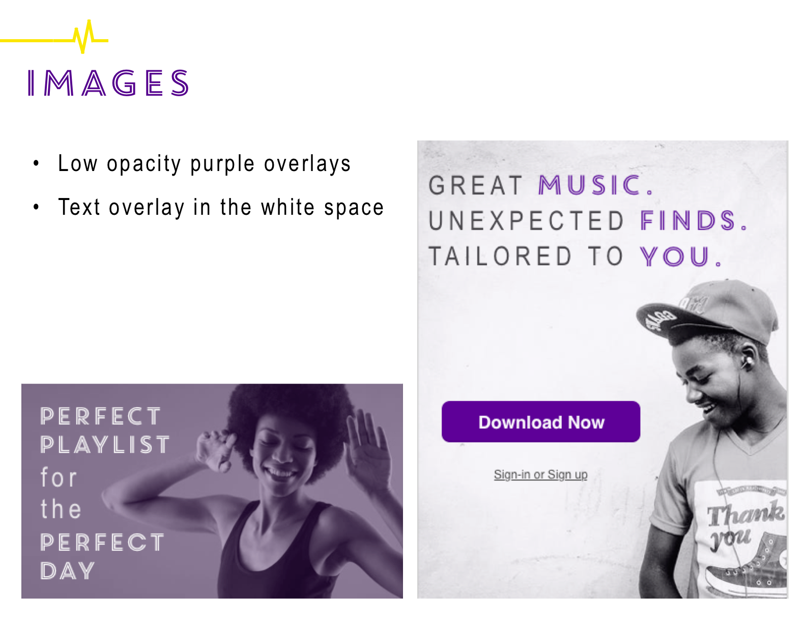
Images:
Purple overlays on images paint the brand, consistency, and feel. The words chosen to overlay the images evoke an emotion, and assign a feeling to the image and the story it’s telling.
Beat.box’s audience listens to music to feel, and I wanted them to start that journey as they interact with the brand.
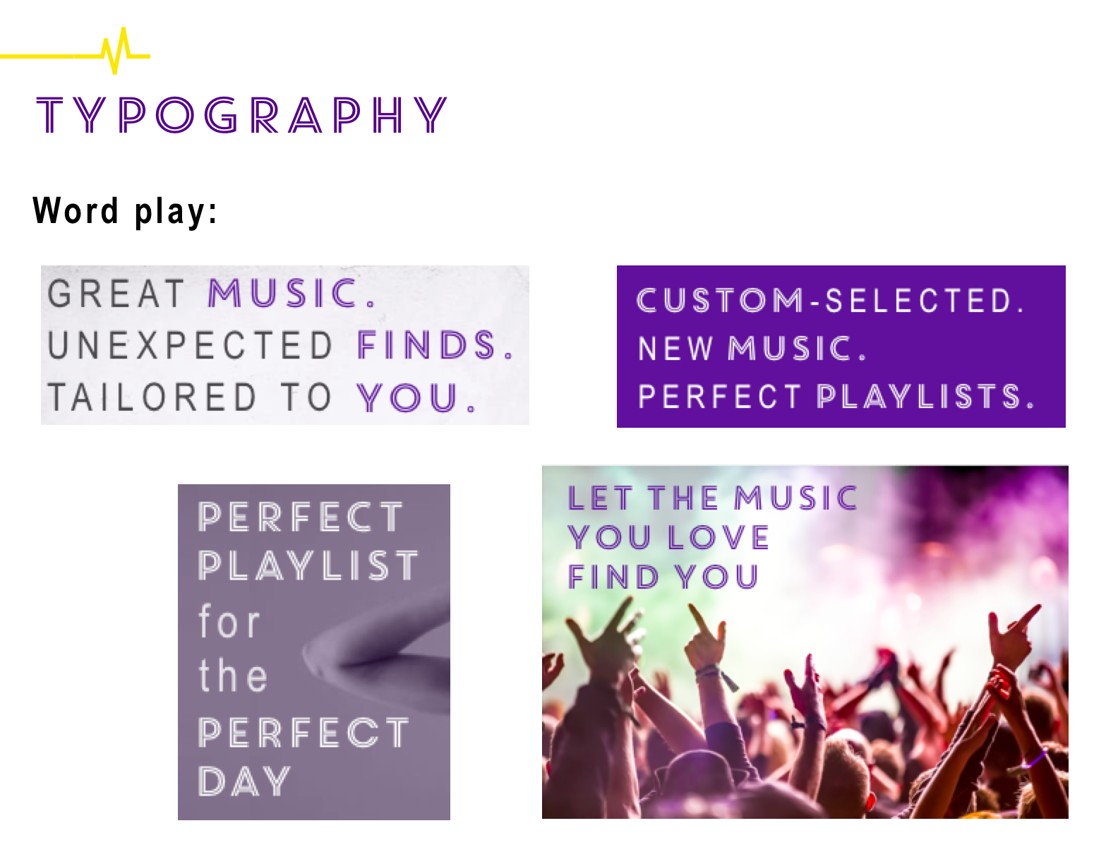
Typography:
Core Circus was inspired by the neon sign; it felt in sync to Beat.box’s young, hip, music nightlife vibe. It’s a unique typeface that has character.
Core Circus is often seen paired with Arial Narrow in headers to offset the bold and busy. This combo allows specific words to shine, drawing your eye to a brand message play on words.
Beat.box’s unique algorithm that finds music for you is exactly what the audience wants: to painlessly be introduced to music. It was my intention to subtly design this message throughout the story using mixed typography.
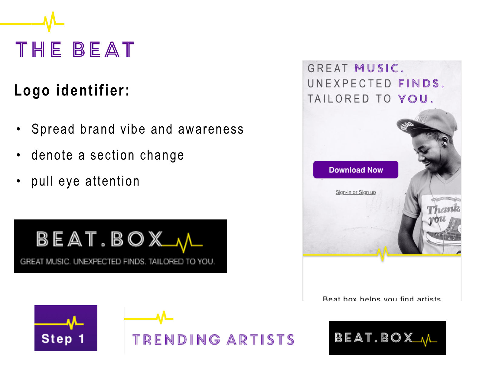
The Beat:
Beat.box is a music service for an audience that listens to feel. Whether it is joy or pain, the users feel alive when listening to music.
The heartbeat symbol represents a music beat for beat.box, and also elicits that feeling of being alive through music for the user.
The beat.box logo I developed includes a yellow beat line, and I incorporated this visual element in various ways through the page.