Problem
The VA knew by the number of downloads that the Mood Coach app was under-utilized. The foundation of the Mood Coach app was built and informed by psychologists and integrates an empirically supported therapeutic approach for depression called Behavioral Activation. The app is designed to help users boost their mood through participation in positive activities.
Given the integrity of the Mood Coach app, the VA wanted to increase user engagement and usefulness.
My Process
As the only team member with a Master’s in Social Work, I led the education and research phase. It was critical that the team understood depression and how it affects people living with it. We needed to understand the user and how the Mood Coach app fit into their lives in order to effectively create change that would meet our client’s needs of increased user engagement and usefulness. We also needed to get the app in front of users for usability testing so we could narrow in on the issues.
Solution
Our goal was to redesign the app while maintaining its integrity, proving usefulness to the user, and increasing engagement. Through user research we learned that the app, in its current state, should be successful at proving usefulness to the user. So it was now our job to figure out the cause for low user engagement. After conducting usability testing we learned that four main issues stood in the way of user engagement: the plan, values, onboarding, and general usability. Our re-design tackled each of these issues to increase user engagement.
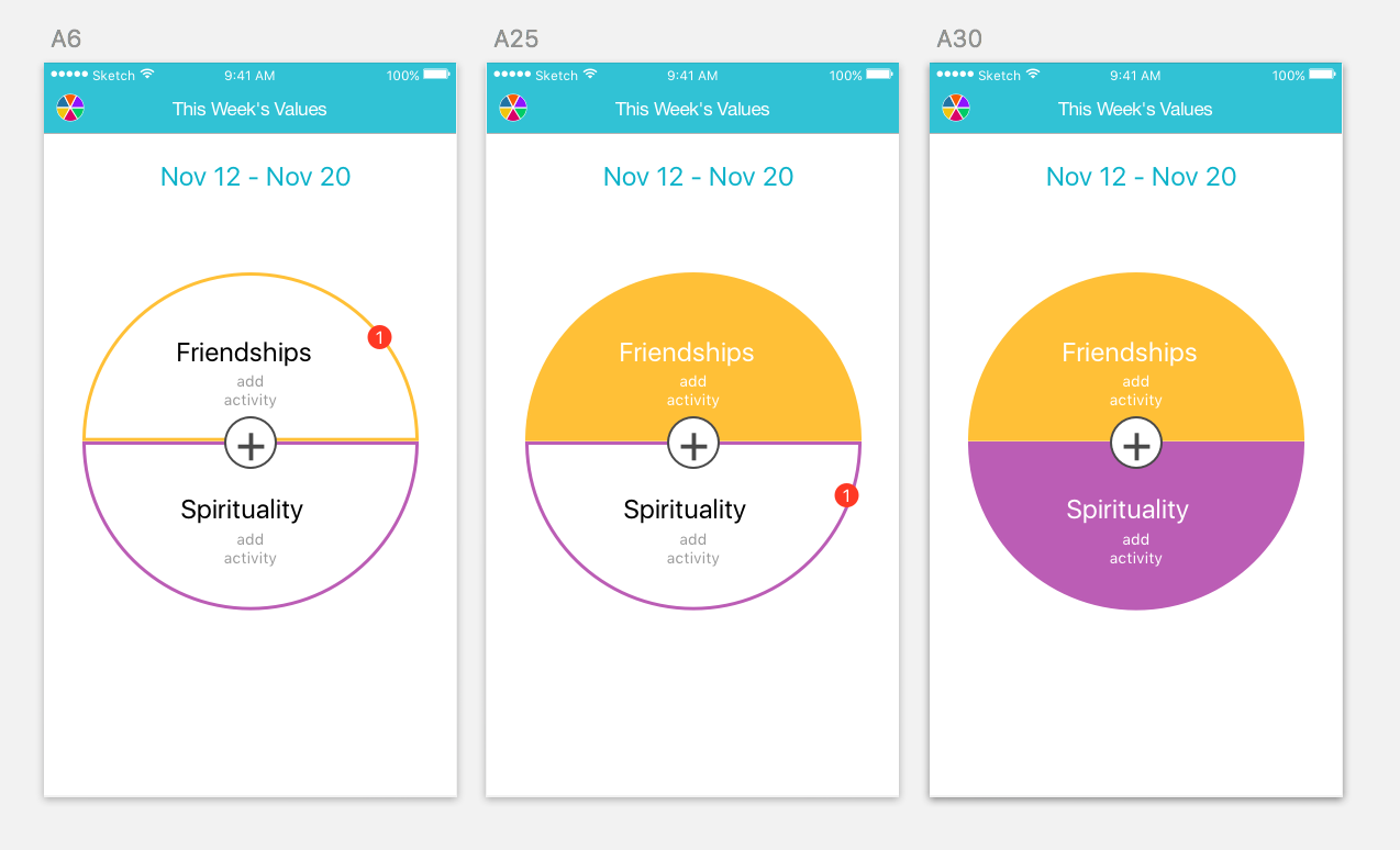
Biggest challenge #2: Clarifying the purpose and relationship of values and activities. We created a visual cue, positioning “activities” inside the “values” wheel, so users would understand the relationship between the two terms.


