Problem
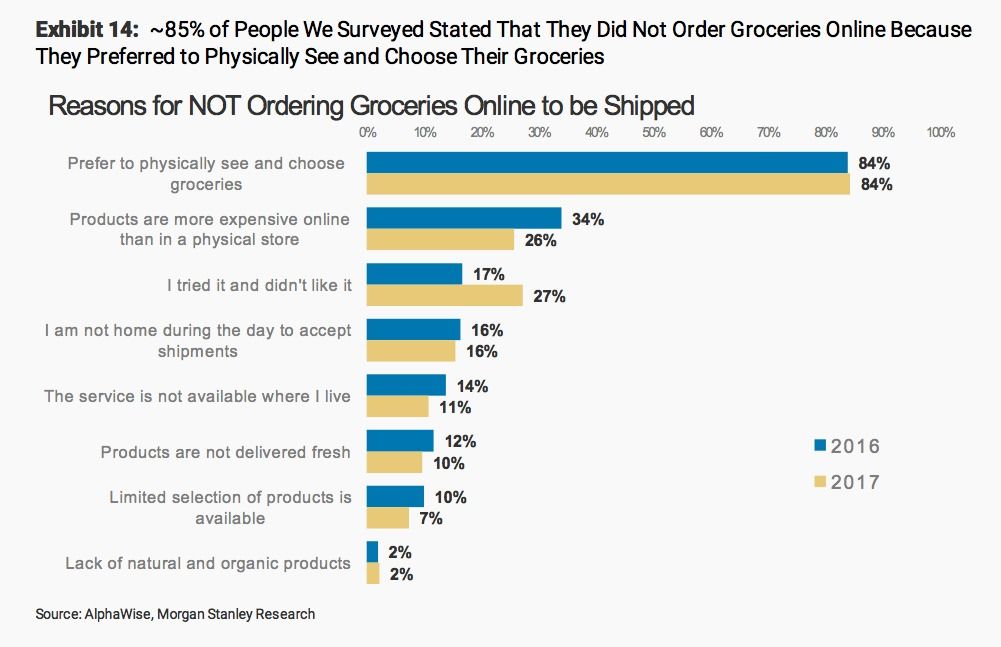
According to one 2017 survey, 85% of people stated that they did not order groceries online because they preferred to physically see and choose their groceries.
Shoppers have specific and particular preferences when buying produce products.
Maybe some folks like their bananas a little brown with zero green on the ends, while others to choose hard, unripe avocados because they aren’t going to eat them for a few days.
Instacart has done a lot to lessen the discomfort users might have about having someone else choose their groceries, including putting time and effort into quality assurance by making a training video for hired shoppers on how to select produce in a ripe and flawless condition.
Solution
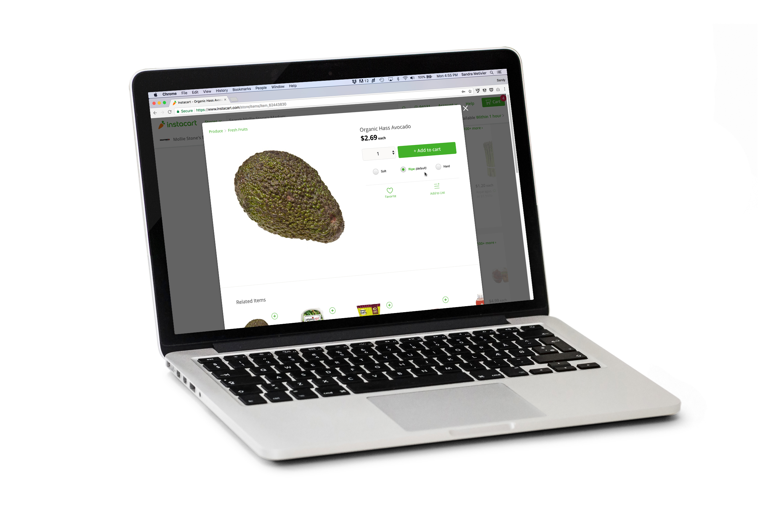
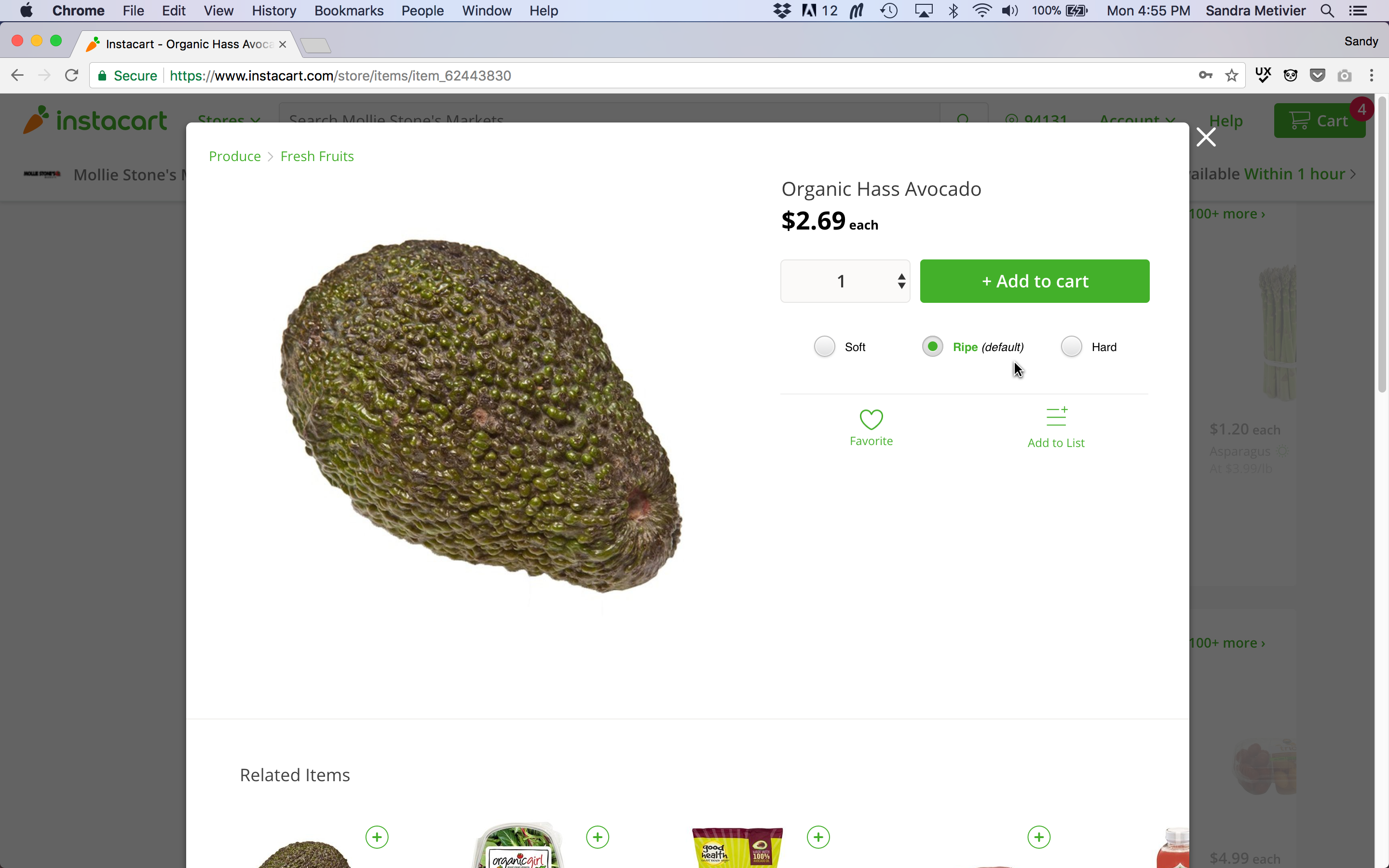
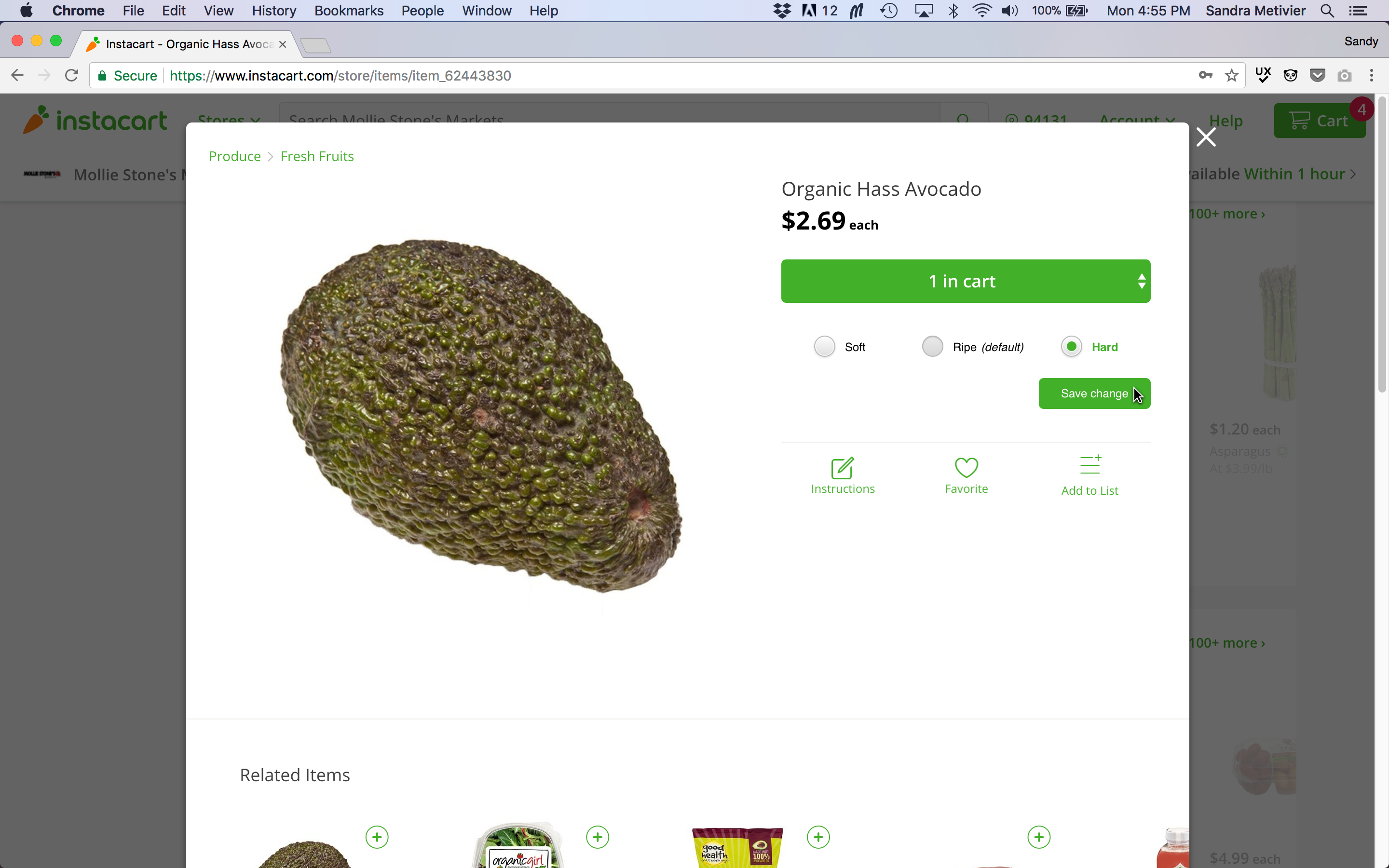
But when it comes to produce, it’s about the look, feel, and personal preference of the buyer, given the available stock. So why not give the buyer a feature to voice their produce preferences?
Instacart does provide a Special Instructions comment box for all items, where a user could type “hard avocados please, I’m not going to make guacamole until Friday”, but not only is that time and effort consuming for the user, it does not instill confidence that the hired shopper will actually read the preference message.
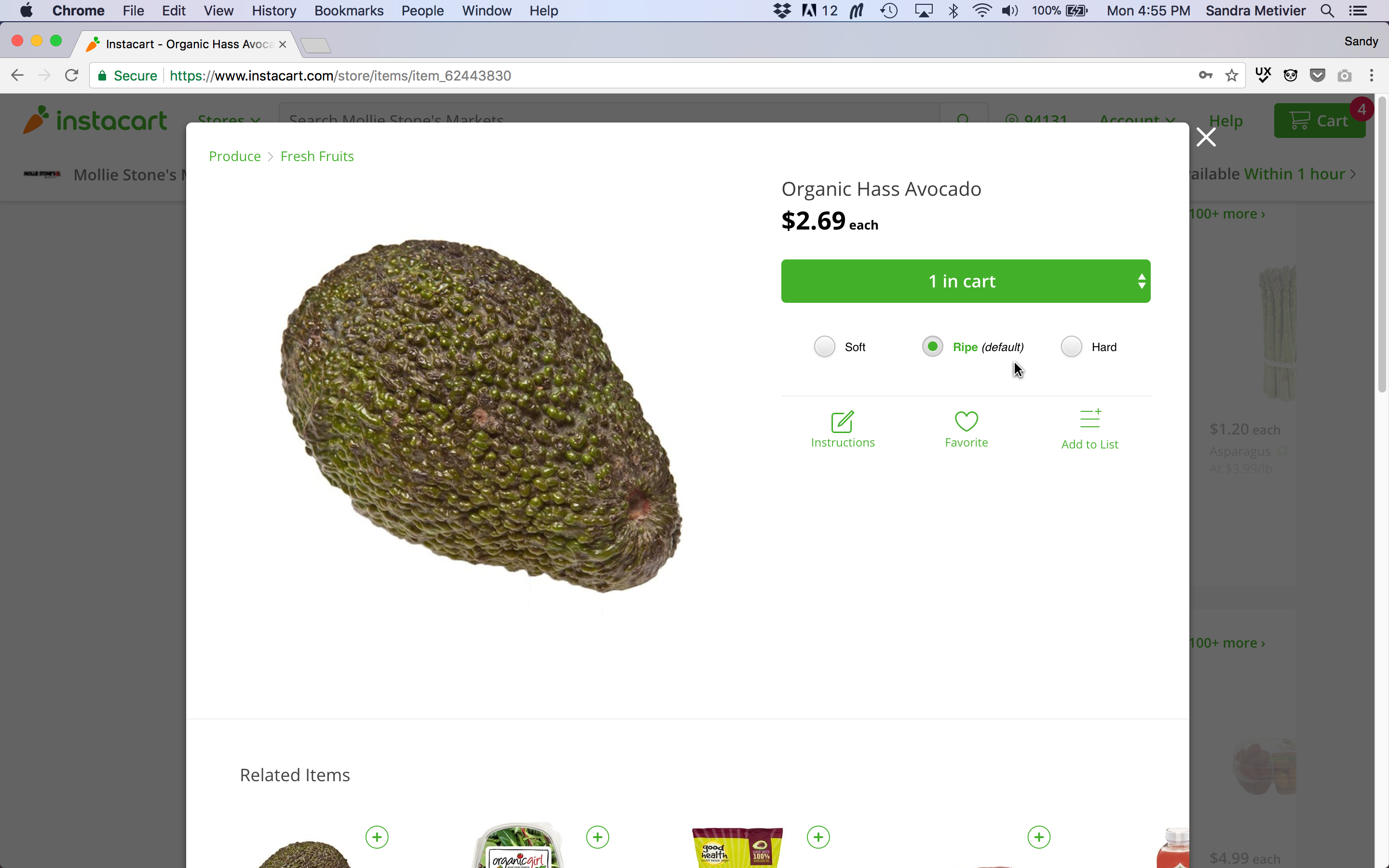
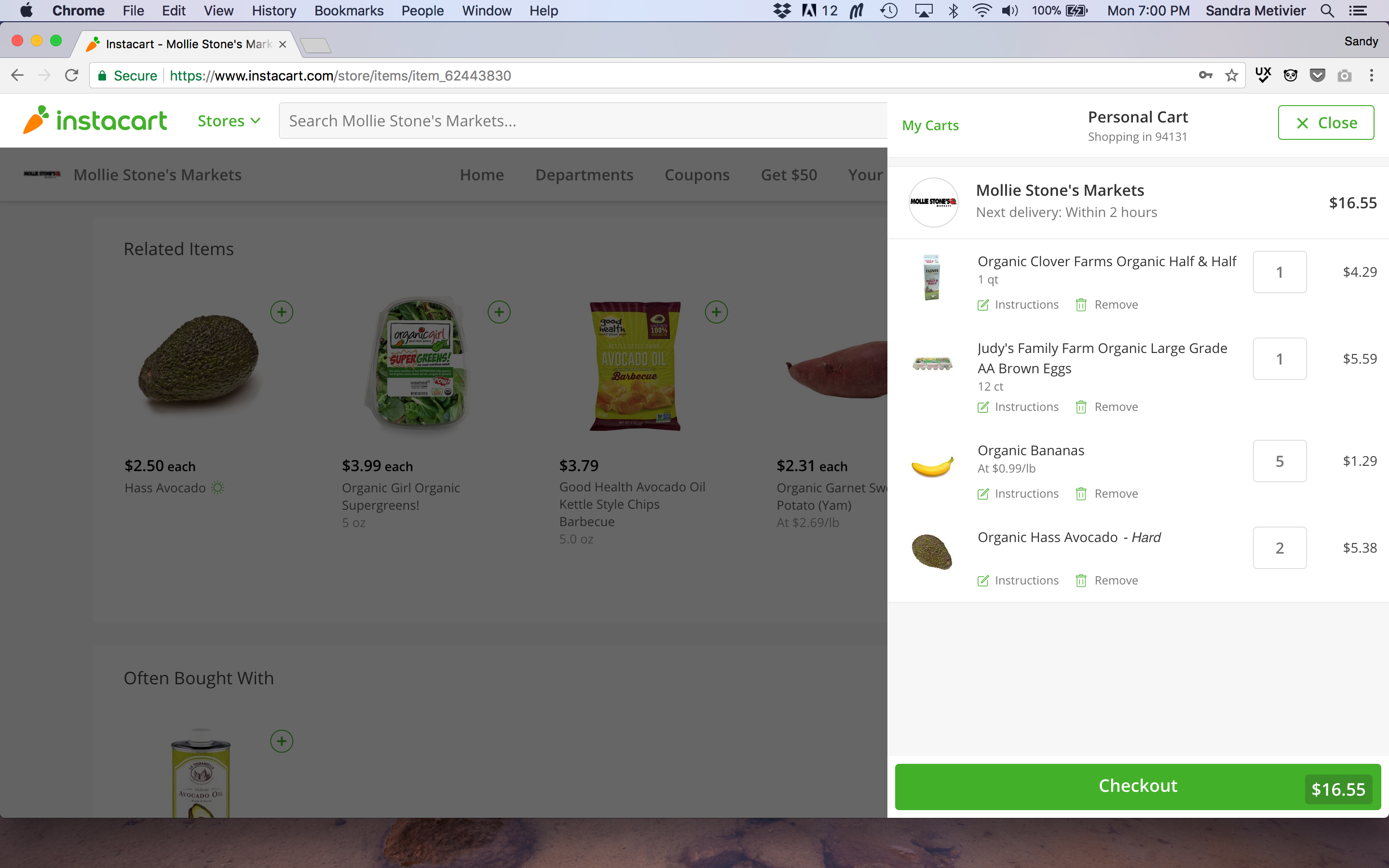
Providing the user with a produce preference feature will help them feel comfortable allowing another person see and choose their groceries, and confident they are going to receive the produce in their preferred state.
The produce preference feature I added to the Instacart Avocado product page was inspired by Postmates, who include several add-ons and preference options in their menu order forms.

